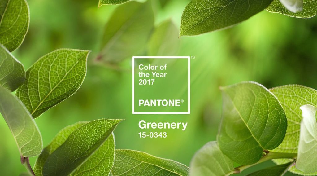
 Greenery is a fresh and zesty yellow-green shade that evokes the first days of spring. In northern California we finally have a lot of rain, which has produced wonderful shades of green in vegetation. A trip through Sonoma County last weekend displayed hillsides covered in wonderful green grass- similar in shading to the “Greenery” color.
Pantone describes the color as “illustrative of flourishing foliage and the lushness of the great outdoors, the fortifying attributes of Greenery signals consumers to take a deep breath, oxygenate and reinvigorate”. Greenery is nature’s neutral. The Greenery color also evokes feelings of renewal, anticipation and excitement. Pantone is a global color authority and provider of professional color standards for the design industries.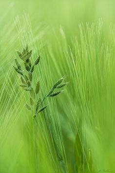

![Pantone-Marsala[1]](https://kbassocdesigns.com/wp-content/uploads/2015/03/Pantone-Marsala1-150x150.jpg) Every year Pantone selects a
Every year Pantone selects a ![2015-color-of-the-year-pantone-marsala-wall-stencils-diy-painting-home-decor[1]](https://kbassocdesigns.com/wp-content/uploads/2015/03/2015-color-of-the-year-pantone-marsala-wall-stencils-diy-painting-home-decor1.jpg)


![Gillies4web[1]](https://kbassocdesigns.com/wp-content/uploads/2014/01/Gillies4web1.jpg)

![Wig04(Classic)_doorsclosed_600px[1]](https://kbassocdesigns.com/wp-content/uploads/2014/01/Wig04Classic_doorsclosed_600px1.jpg)

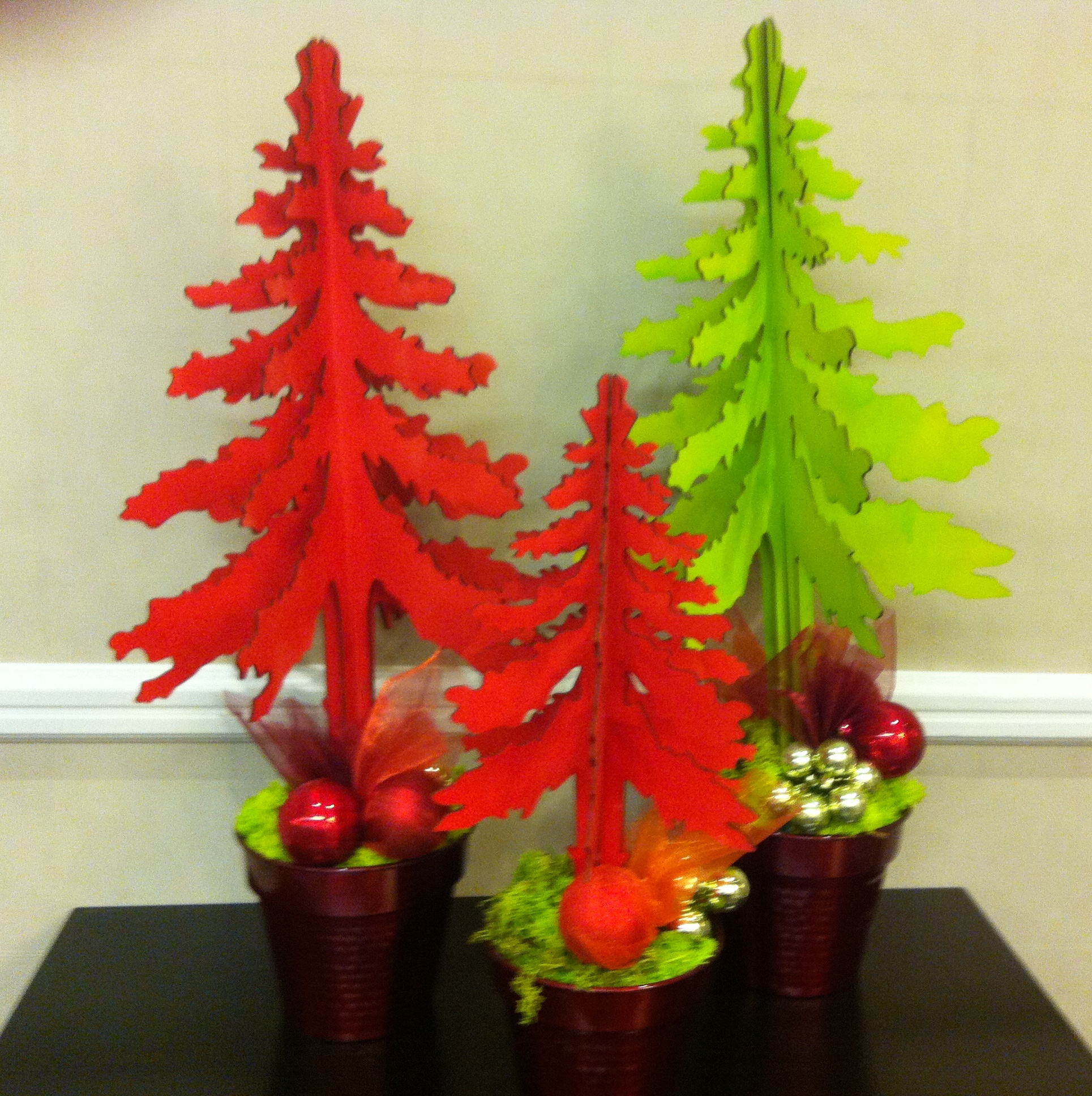
 holiday decorating in northern Europe.