RADIANT ORCHID CHOSEN AS THE 2014 COLOR OF THE YEAR

Last week the Pantone Company announced the color of the year for 2014- “Radiant Orchid”. The new selection is described as “a captivating, magical, enigmatic purple” in the company’s annual announcement.

 1460127_10152059825132629_836749543_n[1]

Leatrice Eiseman, executive director of the Pantone Color Institute, depicts the new color as “an invitation to innovation, expanded creativity and originality”.  She continues that ”it is a captivating purple, one that draws you in with its beguiling charm”.


The selection of the “color of the year” is made by Pantone Company after consulting with representatives from color standards groups from various nations.  An additional color palette is selected for the upcoming year.  These color suggestions help guide fashion, beauty products, interior design and other consumer products.  Color influences for the suggested palette come from the entertainment industry, popular travel destinations, traveling art collections and other cultural or economic conditions. 


The press release suggests that “Radiant Orchid” complements olive and deeper hunter greens and is “a gorgeous combination when paired with turquoise, teal and even light yellows”.  It also would look great with the many popular gray colors seen everywhere in interiors and cabinet offerings.UrbanRevival_OA1


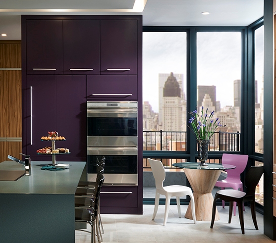
It’s not surprising that a member of the purple family was selected as the color of the year.  Several years ago at the Cologne Furniture Fair numerous furniture and cabinet manufacturers were showing a rich purple color a bit darker than the “Radiant Orchid”. 


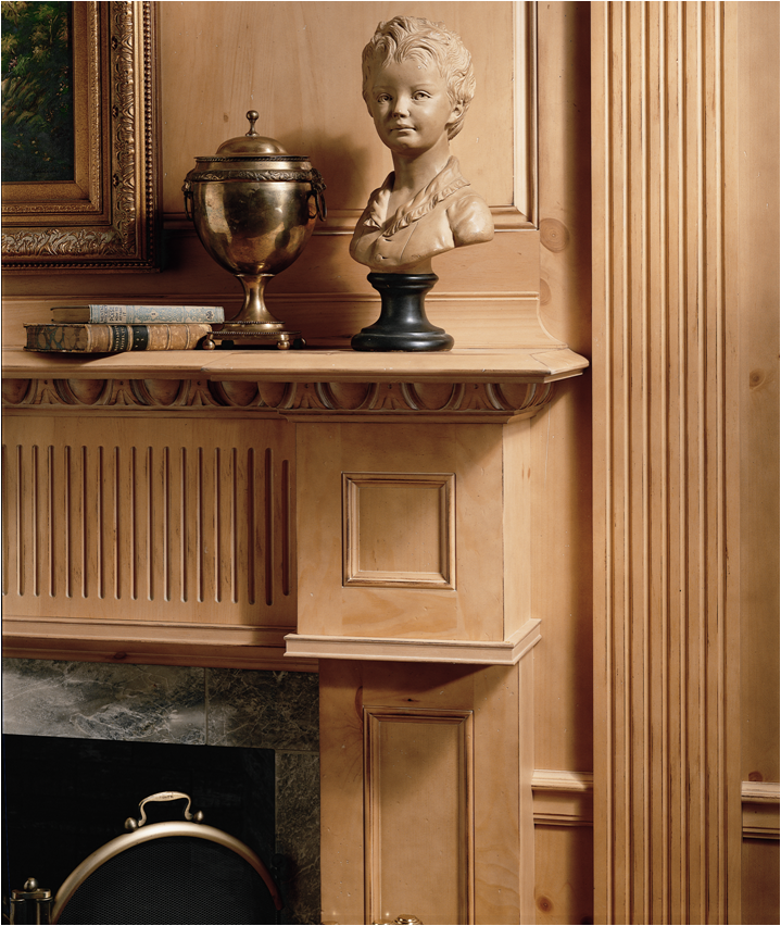
photo courtesy of Wood-Mode Cabinetry

The importance of good detailing

As the former representative for Wood-Mode Cabinetry in Northern California and Nevada, I have enjoyed the opportunity to visit a number of cabinet installations. As part of our duties as the rep agency, we checked all the orders submitted in our territory against the floor plans. So I have viewed probably several thousand cabinet layouts over my career.


Picture1

From this experience I have seen first hand the importance of good detailing. What does this mean? Good detailing can be seen in the small fine points.  How do the mouldings fit together when installed? Do the drawers in the corner clear each other when opened? How is the depth of the countertop accommodated next to a tall cabinet? It takes time to develop the skills necessary to create designs that pay attention to details.  Some of this knowledge is learned through practical experience (sometimes through making an error!) and observation. Some knowledge is provided by manufacturers through their product specifications or product training. Visiting trade shows and factory showrooms provides designers additional opportunities to view cabinet installations.


A good designer is able to think and see in three dimensions. This ability helps the designer look beyond the flat floor plan to prevent clearance problems, oddly sized doors or awkward looking conditions.

HudsonValley_Molding-MullionDetailGood detailing can also mean creating special moulding combinations, unique embellishments, or features that reflect the personality of the client or the house for which the design is created. Good detailing also demonstrates the compentency of the designer. Good detailing can provide delightful touches that enhance the room for the client.


(photos courtesy of Wood-Mode Custom Cabinetry)

WHAT WAS A “DREAM KITCHEN” ONE HUNDRED YEARS AGO?

hoosier jpgIf a person thumbed through popular women’s magazines, such as “A Woman’s Home Companion” or ”Ladies Home Journal”, one hundred years ago one would see advertisements for a work center or kitchen cabinet that commonly became known as a “Hoosier” cabinet, named after the preeminent manufacturer of the kitchen center units. Built-in cabinetry so standard today would not become common for several more decades.

These units, which were about four to five feet wide and about six feet tall, were welcomed as a time saver for housewives. Just as efficiency in the office and on the manufacturing floor was being studied and quantified, so was the efficiency of the American home. Harrington Emerson, the “father of efficiency engineers”, proposed that the use of these units could reduce meal preparation time by half.

A study commissioned in 1920 by the U.S. Department of Commerce found that the use of a work center could save the American housewife 1,592 of the 2,113 steps she took in her kitchen every day. These cabinets consolidated baking and storage items in a small space.

Using imaginative wording that would make Don Draper of the hit television show Mad Men jealous, the advertisements touted that these units would “add zest to daily duties”, be “labor saving- step saving” and be a “lightener of dreary routine”. Manufacturers placed numerous advertisements in magazines and newspapers describing the easier life a housewife would enjoy if she owned a kitchen center.

The original design is thought to come from the “baker’s cabinet”, which had a work top with storage above. The new units contained bins for flour, sugar and coffee. Spices, towels, mixing bowls and linens all had a place in which to be stored. A cabinet below had space for pans and lids with drawers on the side. A countertop, which often pulled forward for more space, was made of wood, zinc or porcelain covered metal. Some units had a built-in flour sifter, pull out bins, a bread board for cutting, and even an ant trap (whatever that was!)

The state of Indiana became the center of manufacturing for the kitchen cabinet industry. Because of abundant forests containing oak, hickory, maple, elm and beech, Indiana had a thriving lumber and furniture industry. Dozens of manufacturing companies produced thousands of these units per week during the first two decades of the twentieth century. They were sold across the country in department stores such as Macy’s and Gimbels, and by furniture retailers and factory agents.

kitchen center4The cost to purchase the “dream kitchen” in 1905 was from $15.75- $54.00, depending on how large and how many features were included. This may not seem like much today, but when the average yearly salary for an American was about $400-600, its purchase would have to be carefully budgeted. In 1914 an advertisement for the Hoosier company in the “Saturday Evening Post” promoted a buying plan of $1 down and the balance to be paid at $1 per week (with no interest charges).

Judging from the popularity of the units the kitchen center was truly the “Dream Kitchen” for our grandmothers and great-grandmothers.

How did you select the painting for your website?

the kitchenmaidSometimes when I give people my business card I’m asked “how did you find or select the painting?” The short answer is, of course, searching through websites on the internet. The selection reason is a bit more involved.

When I decided to continue my career in the Kitchen & Bath Industry I wanted to use an image that would be different from the standard beautiful kitchen photograph. I’ve always enjoyed fine art so I thought it would be fun to find an old painting or engraving showing a kitchen scene. Initially I looked for a black and white line drawing or engraving, but couldn’t find anything that captured my imagination.

Then I searched through many websites showing paintings and finally found “The Kitchenmaid” by Guiseppe Crespi, an Italian artist who painted from about 1680-1735. Crespi is best known for his baroque genre (scenes of everyday life as opposed to portraits of wealthy patrons) paintings. He utilized “chiaroscuro”, which is the use of strong contrasts between light and dark areas in a painting.

When I found the painting I was immediately attracted to its intimate setting and the depiction of light falling on the maid. Months later I realized that there were other reasons I liked the painting. The maid is standing on a footstool to be able to better complete her tasks. Since I’m only five feet tall, (well almost!) I can appreciate the need to stand on a platform to reach things. As a child I would help my mother wash the dishes by standing on a chair and then later a footstool when I got a bit taller.

The other reason I especially liked the painting is the use of color. The dusty blue of her shirt and soft orange-brown of her apron provide a nice contrast. On the Color Wheel orange and blue are “complementary colors”, or opposite each other on the Color Wheel. When placed next to each other complementary colors create the strongest contrast and reinforce each other.

Recently, though, I had a moment of second thoughts about the selection- what if people think that’s what their kitchen will look like when I design something for them (poor lighting, no storage, wrong work counter height)? I hope not!  Rather, I hope people will think about how warm and intimate the painting is and will want to create the same feeling in their own home.

A Tribute & Recognition

After over thirty years of serving as the factory representative covering northern California and Nevada for Wood-Mode Custom Cabinetry, it was time to make a change. The factory hosted me and another rep at a pleasant “Tribute dinner” during the KBIS recently in New Orleans. I was presented with a wonderful framed tribute, which is shown here.Pam-Tribute

A new direction-

After a thirty plus year career as the factory representative for Wood-Mode Custom Cabinetry in Northern California and Nevada it was time for a change. I’m excited (and anxious) to start a new phase of my life as an independent design and marketing consultant for the Kitchen and Bath Industry. I used to marvel at what I perceived to be the bravery of independent designers- and now I am one!

As a representative I helped our dealer base develop their sales and supported them in the design and ordering process, as well as their marketing efforts. I really enjoyed visiting accounts and working with them to be successful with our products and their individual businesses.

So now I’m going to concentrate on cabinet design and sales for new construction and remodeling projects, as well as marketing & consulting endeavors for cabinet showrooms. I have rented a small office studio in Redwood City with a nice view of the salt evaporation ponds and the Bay in the distance. At the studio I have sample doors, display cabinets and other sales aids to help clients. I’ve posted profiles on Cultivate and Houzz– so I’m ready to go!

In future blogs I’ll be covering design trends, reviewing trade shows, product information and other musings. Watch for weekly postings!