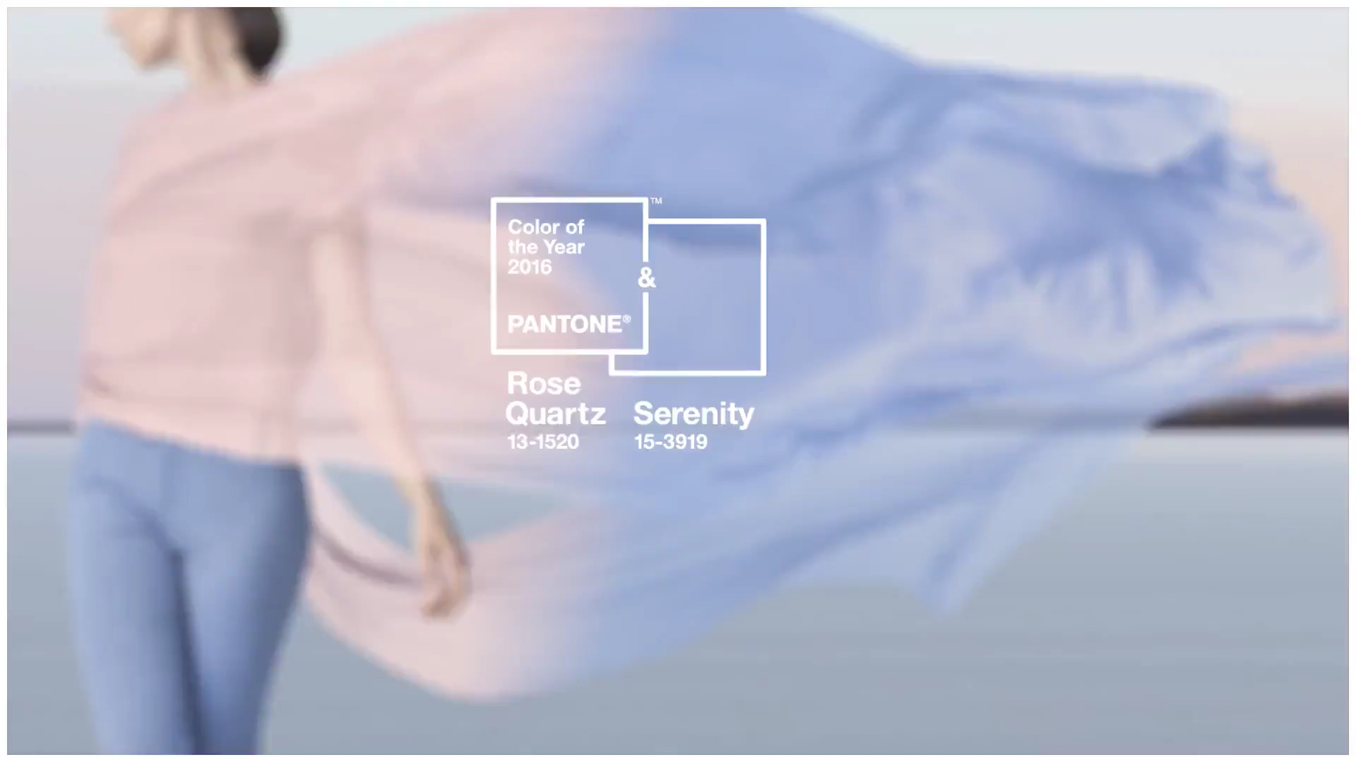
 For the first time ever, Pantone has selected two shades for the “Color of the Year”. According to Pantone Rose Quartz– is a persuasive yet gentle tone that conveys compassion and a sense of composure. Serenity is weightless and airy, like the expanse of the blue sky above us, bringing feelings of respite and relaxation even in turbulent times. The color combination replicates the wonderful colors seen at cloudy sunset.
The pairing of the two colors brings calm and relaxation. “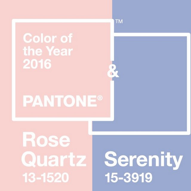 Wearing both of these hues at once is like returning to the weightlessness of your youth,” says Leatrice Eiseman, executive director of Pantone . “The combination of a cool and a warm color brings a sense of balance.”
 Although probably this will be seen more in clothing than interiors, the baby hues can used together in wall papers, fabrics and color schemes. The color combination would work well in a powder room, dressing area or a girl’s room.